- Load the R package we will use.
Question: modify slide 51
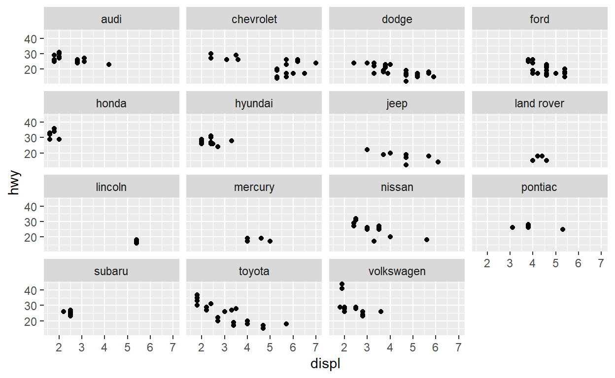
Create a plot with the mpg dataset
add points with geom_point
assign the variable
displto the x-axisassign the variable
hwyto the y-axis
add
facet_wrapto split the data into panels based on themanufacturer
Question: Modify facet-ex-2
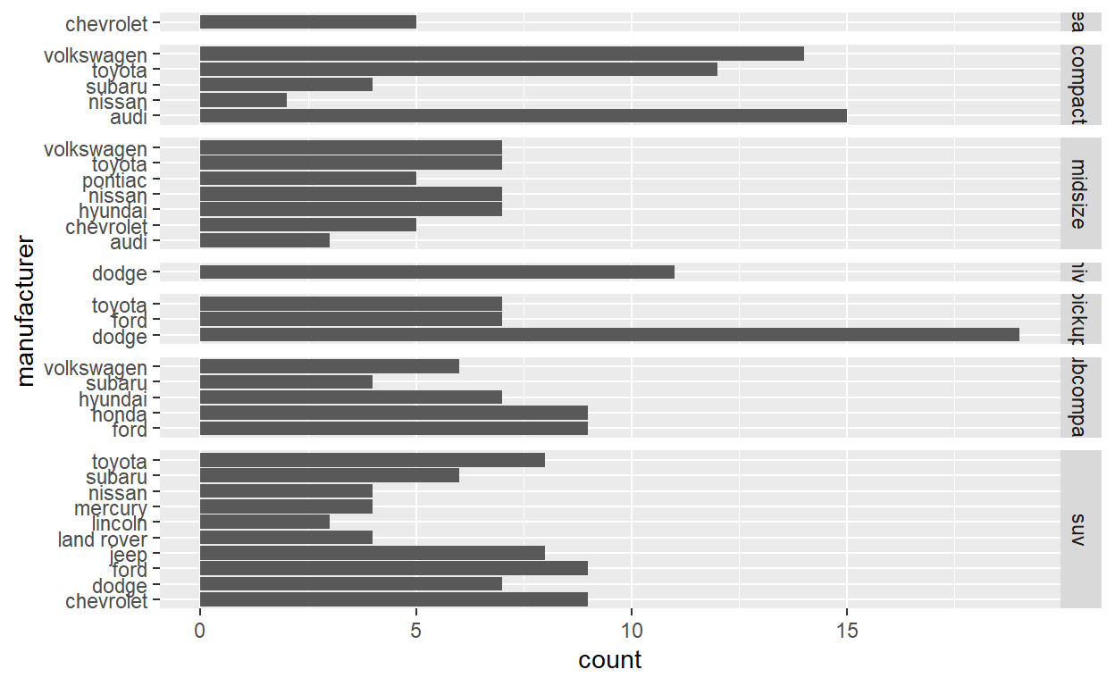
Create a plot with the
mpgdatasetadd bars with
geom_bar-assign the variablemanufacturerto the y-axisadd
facet_gridto split the data into panels based on theclasslet scales vary across columns
let space taken up by panels vary by column
Question: spend_time
To help you complete this question use:
- the patchwork slides and
- the vignette: https://patchwork.data-imaginist.com/articles/patchwork.html
Download the file spend_time.csv from moodle
spend_timecontains 10 years of data on how many hours Americans spend on each day on 5 activitiesread it into
spend_time
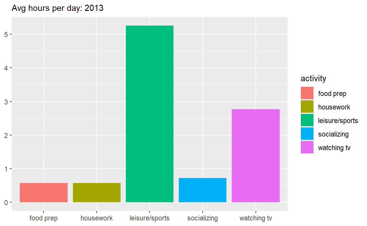
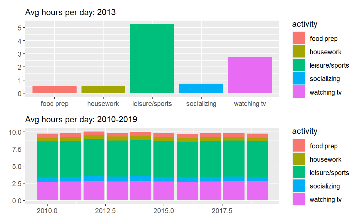
Start with spend_time
- extract observations for 2013
- THEN create a plot with that data
- ADD a bar chart with
geom_col- assign
activityto the x-axis - assign
avg_hoursto the y-axis - assign
activityto fill
- assign
- ADD
scale_y_continuouswith breaks every hour from 0 to 6 hours - ADD
labsto- set
subtitleto Avg hours per day: 2013 - set
xandyto NULL so they won’t be labeled
- set
- assign the output to
p1 - display
p1
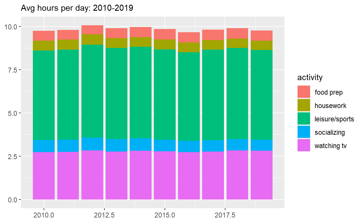
Start with spend_time
- THEN create a plot with it
- ADD a barchart with
geom_col- assign
yearto the x-axis - assign
avg_hoursto the y-axis - assign
activityto fill
- assign
- ADD
labsto- set subtitle to “Avg hours per day: 2010-2019”
- set x and y to NULL so they won’t be labeled
- assign the output to
p2 - display
p2
Use patchwork to display p1 on top of p2
assign the output to
p_alldisplay
p_all
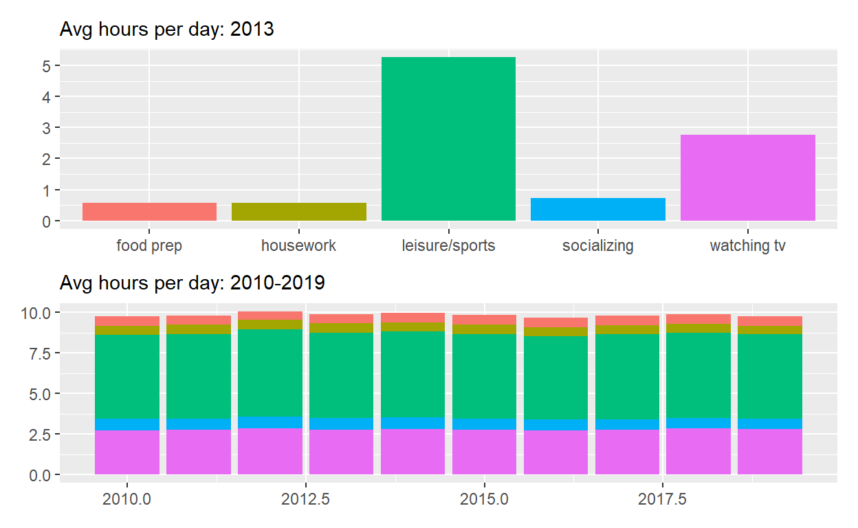
Start with p_all
- AND set
legend.positionto ‘none’ to get rid of the legend - assign the output to
p_all_no_legend - display
p_all_no_legend
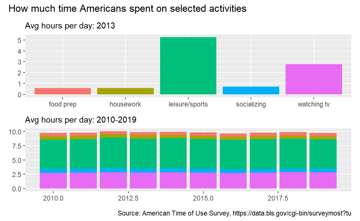
Start with p_all_no_legend
see how to annotate the composition here: https://patchwork.data-imaginist.com/reference/plot_annotation.html
ADD
plot_annotationsettitleto “How much time Americans spent on selected activities”captionto “Source: American Time of Use Survey, https://data.bls.gov/cgi-bin/surverymost?tu”
Question: Patchwork 2
use spend_time from last quaestion patchwork slides
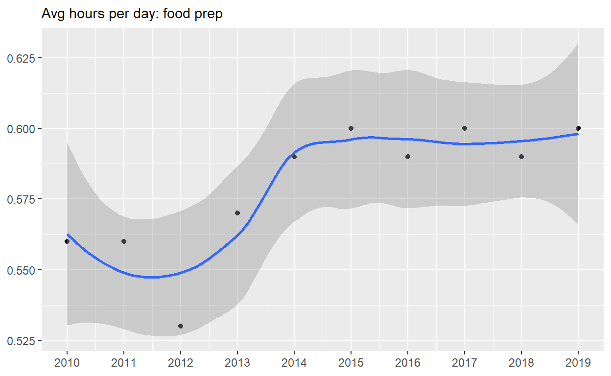
Start with spend_time
- extract observations from food prep
- THEN create a plot with that data
- ADD points with
geom_point- assign
yearto the x-axis - assign
avg_hoursto the y-axis
- assign
- ADD line with
geom_smooth- assign
yearto the x-axis - assign
avg_hoursto the y-axis
- assign
- ADD breaks on for every year on x axis with
scale_x_continuous - ADD
labsto- set
subtitleto Avg hours per day: food prep - set
xandyto NULL so x and y axes won’t be labeled
- set
- assign the output to
p4 - display
p4
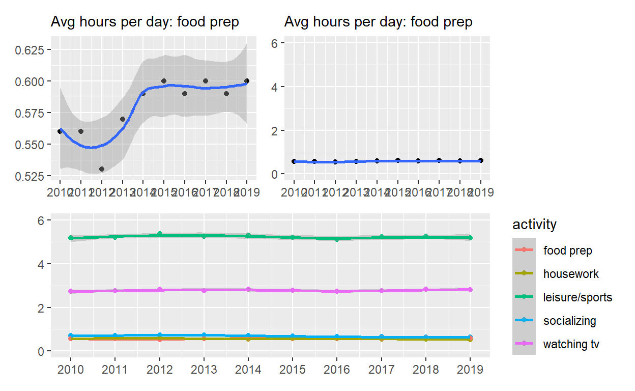
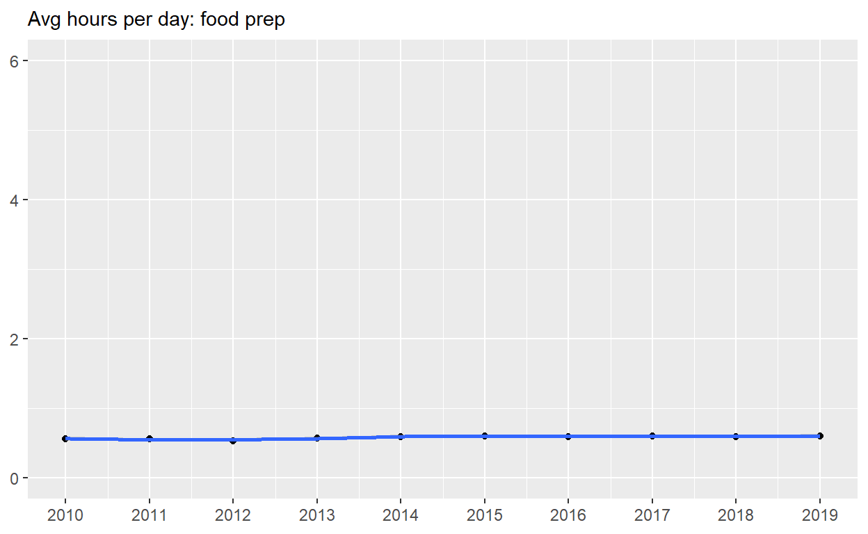
Start with p4
- ADD
coord_cartesianto change range on y axis to 0 and 6 - assign the output to
p5 - display
p5
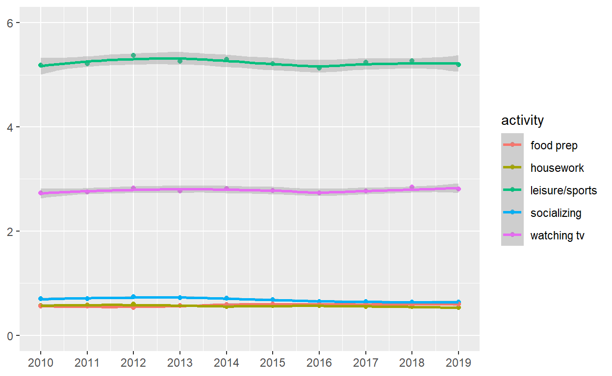
Start with spend_time
- create a plot with that data
- ADD points with
geom_point- assign
yearto the x-axis - assign
avg_hoursto the y-axis - assign
activityto color - assign
activityto group
- assign
- ADD line with
geom_smooth- assign ’year` to the x-axis
- assign
avg_hoursto the y-axis - assign
activityto color - assign
activityto group
- ADD breaks on for every year on the x-axis with
scale_x_continuous - ADD
coord_cartesianto change range on y axis to 0 to 6 - ADD
labsto- set
xandyto NULL so they won’t be labeled
- set
- assign the output to
p6 - display
p6
Use patchwork to display p4 and p5 on top of p6